.png)
Company/Client
David Travis
Challenge
Digital Postcard: The goal for this project was to create a mobile phone app that will allow users to create their own postcard by using a photo on their phone, add a message or design elements to the image, and submit for delivery to a recipient's home address.
Role
UI/UX Design, Information Architecture
Carry out a user research to identify if there is a need in the market.
Identify key user groups and define their goals
Develop a prototype and run a usability test.
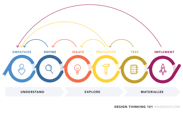
To complete the project I decided to use the design thinking iterative process. This method allowed me to understand users, challenge assumptions, redefine problems and create innovative solutions to prototype and test.
I wanted to gain an empathic understanding of the problem that I was trying solve and this involved selecting appropriate methods of research, hence the reason I chose contextual inquiry and user interview.
I conducted 5 contextual interviews to provide insight into the environment or context in which users send postcards.The session consisted of a mix between the normal user interview and observations of how users send postcards online and offline. Users actions were recorded in context and observations logged.
After each contextual interview session, I asked a few questions relating to their experience and tasks. My questions were unstructured and I built upon them as the interview progressed. The aim of the interview was to understand who the user was, their goals and pain points.
Needs & Pain Points:
Simple and easy way to send a postcard
Reliable and fast delivery service
Flexible design options
Notifications on progress of order
Clear navigation for a seamless experience
I observed the following apps: TouchNote, MyPostcard and SimplyCards. I wanted to understand their type of users, popularity and app functions so I looked at their social media page, website and Google play reviews.
Findings:
Combined total of 3M+ downloads suggesting that there is a need for this service.
Emphasized features on Homepage
Negative reviews mainly around delayed delivery and error while using product.
Minimal and simple UI interface
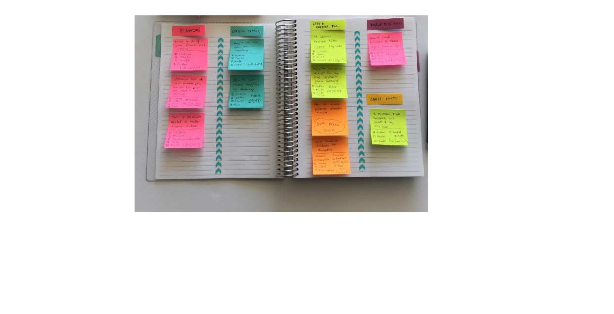
With the information I gathered from the Empathise stage, I analyzed my observations and used affinity sorts to group users into thematic clusters. This helped me identify the core problems users face and this was the basis for my Persona creation.
Jackie was based upon my research to represent the different user types that might use the app — helping me to understand users’ needs, experiences, behaviours and goals.

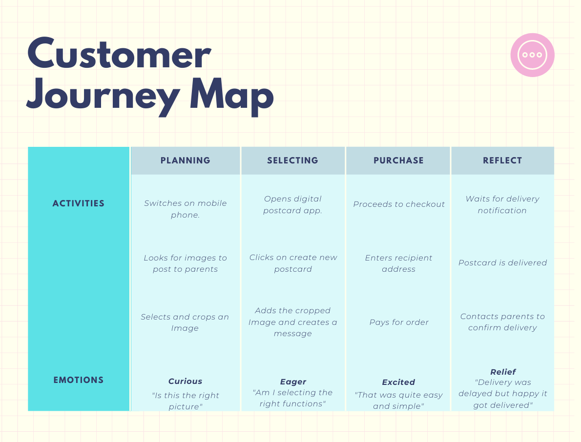
I created a customer journey to show Jackie's behaviour and pain points while purchasing the postcard.
Based on the analysis of my research data, I identified 10 key user tasks on the application that will solve the user's need. I then defined the most important and critical tasks based on frequency of use. These tasks will include:
Create/delete a new postcard
Add/Edit design elements to postcard
Add/Edit images to postcard
Add/Edit personalised messages
Compare postage prices
Recieve post/delivery notifications
Track purchased orders
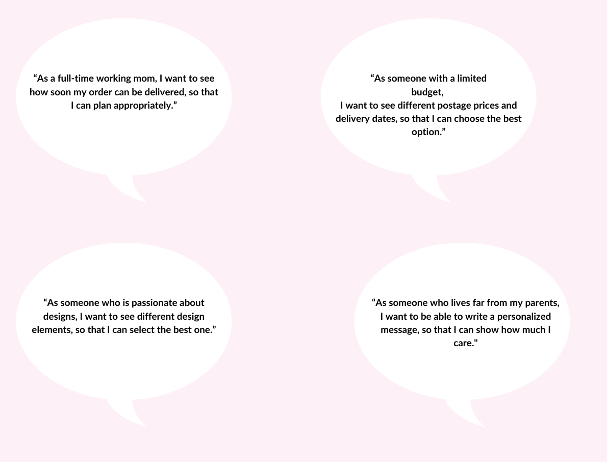
I also created user stories to articulate how the app will meet the user's needs.
User flow is the path taken by a prototypical user on a website or app to complete a task. The user flow takes them from their entry point through a set of steps towards a successful outcome and final action, and this is what I tried to capture while sketching the mock flow below. This was a skeletal representation of the series of steps the user will take to achieve her goal on the app.
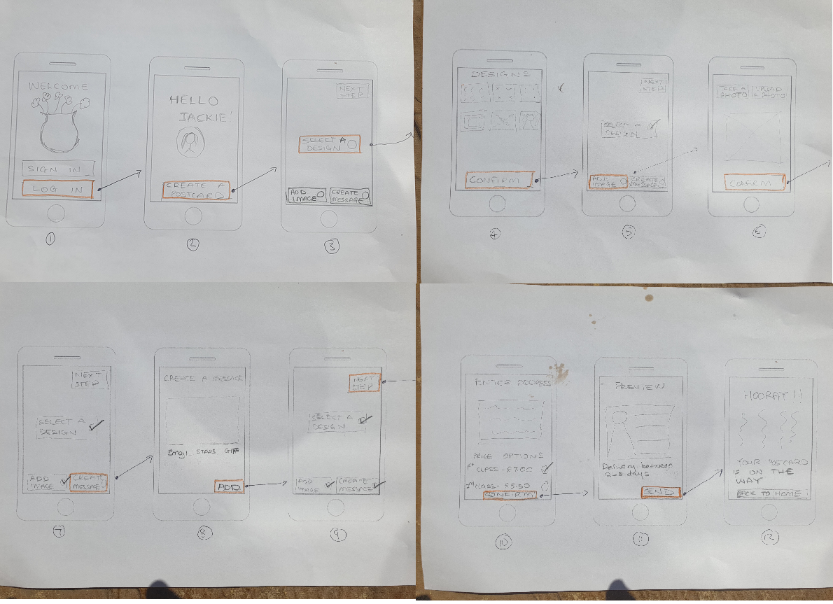
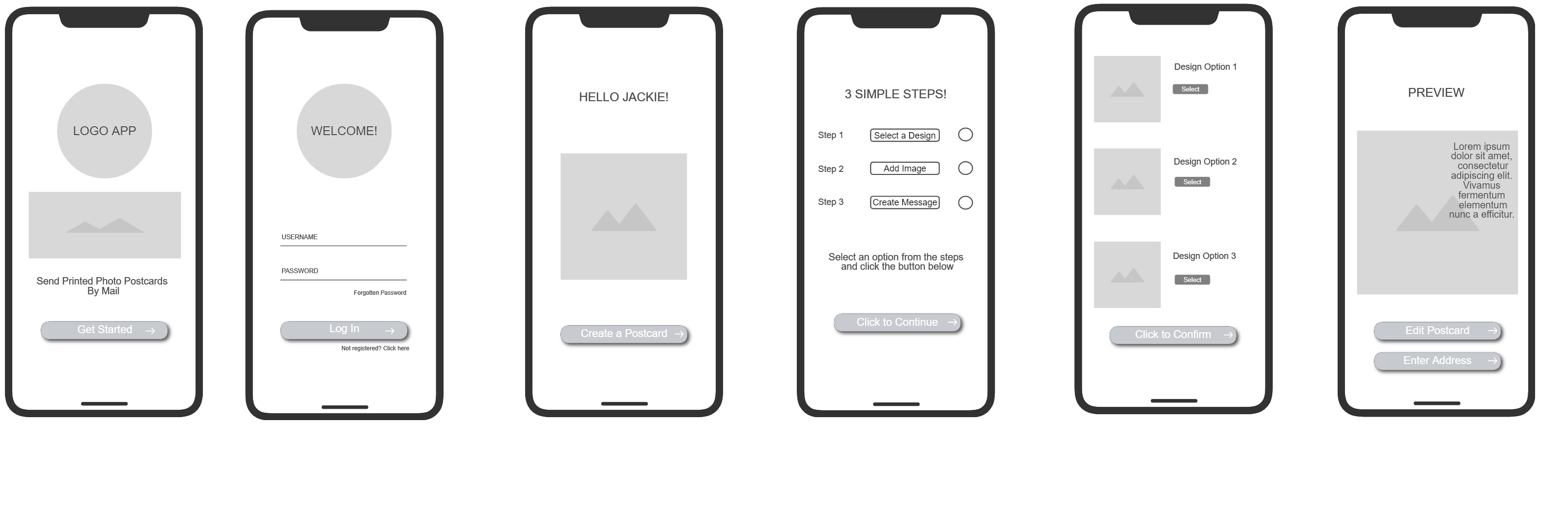
Using the user flow as a guide, I created wireframes of the Digital Postcard App. Wireframing is an efective tool to design great user experiences and detecting early usability issues.
To understand if I was on the right path, I tested out the prototype on two users. The tests were iterative and followed a process to collect feedback, refine and re-test. During the testing session, I gave the user a scenario with 3 tasks.
Test scenario 1: Imagine you travelled on holiday and are visiting tourist attractions. You want to send a postcard to your 75 year old mum. Your mum is not digitally savvy and prefers postcards sent via post.
1. Create a Postcard
2. Customise the Postcard
3. Send it to your Mom
Insights:
Users were not able to cancel postcard or return to previous page.
An option to sign in via social media might speed up the process.
Users would like an option to include emoji's or designs to message.
Users would like to have different payment options.
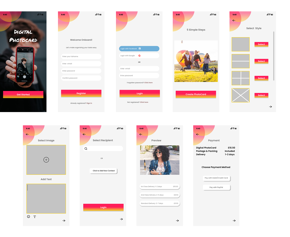
After several iterative tests with users, I designed high fidelity and refined screens, incorporating design principles like white spaces, typograpgy and hierachy. These changes improved the design solution and made the app more usable, useful and effective.
I chose radiant and warm colours to give the interface a modern
outlook.
For text, a darker variation was used to ensure reading and
contrast, thus reaching appropriate levels of accessibility.
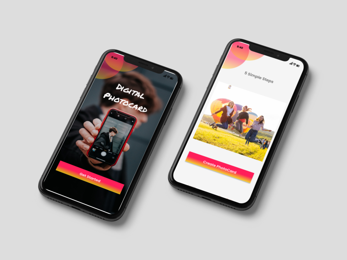
A modern and minimal welcome screen
Login via email and social media options
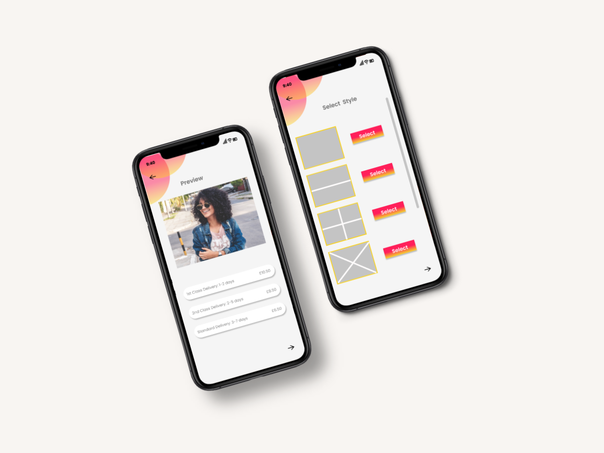
Simplified step by step process to create and send postcards
Improved styling options for images and messages
Ability to add contacts from address book or create new contact
Improved navigation using back and forward arrows
Iterative tests are very important to achieve a user-centred solution.
Contextual inquiry is important for identifying users needs, behaviours and pain points.
Early usability testing will help identify pain points early before they become a problem.