Company/Client
Greenwich Leisure Limited - Fitness App
Scope
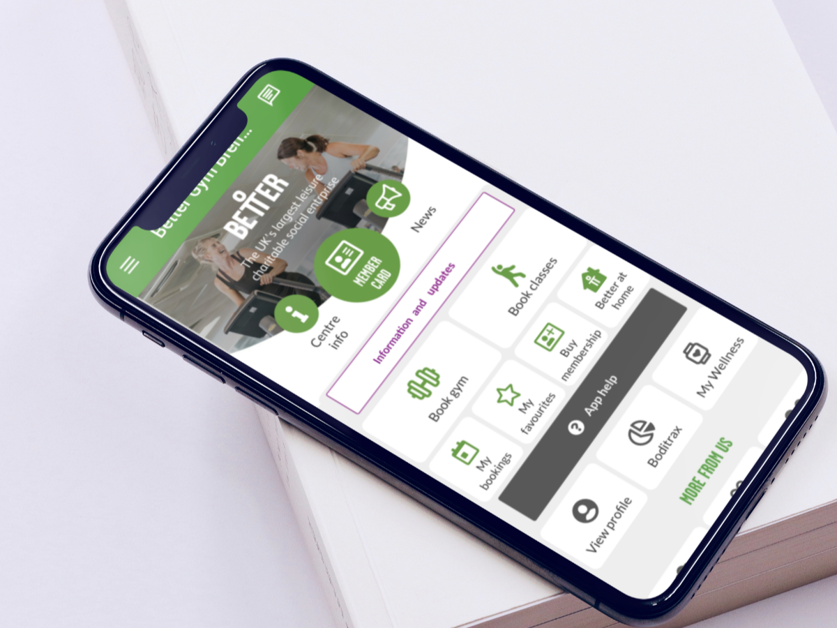
The fitness app allows members to book classes and sports activities, find local facility and pool opening times. Additionally, they are able buy tickets for activities, get facility news and lots more.
Role
I worked within the design team as a UX/UI Designer and we were responsible for maximising user experience through improved app features and styles.
We spoke with the project manager and business stakeholders to get a better understanding of the business goals and needs. The goals highlighted include:
Create new features that will improve user experience.
Improve app architecture and navigation.
Increase conversion through a clear and simple checkout process.
Limited developer Resources
Design scope was limited to fit around the developer's code library
There was limited time resources due to an urgent deadline.
We adopted the design thinking iterative process as this method allows us to understand our users and create innovative solutions through iterative prototyping and testing.
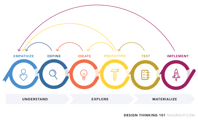
We needed to gather adequate information about our users, their needs and painpoints, so we adopted different research methods to achieve this goal.
I decided to conduct a heuristic evaluation of the app while booking a fitness activity for myself. After the evaluation, I discovered the following issues:
Inconsistency in the use of background colours in the home page and subpages.
The exits where not clearly marked and i got confused about going back to the previous page.
Users should be able to set notifications of events and activities
To validate my findings, we conducted usability tests and asked users to perform some tasks on the app. I encouraged them to think aloud while performing the tasks and asked questions after they completed the tasks. The result from 10 user interviews and usability tests provided the following insights:
Long and complex online booking process.
Unnecessary and distracting content
Difficult to find the button to cancel a booking
Unable to find the notifications button
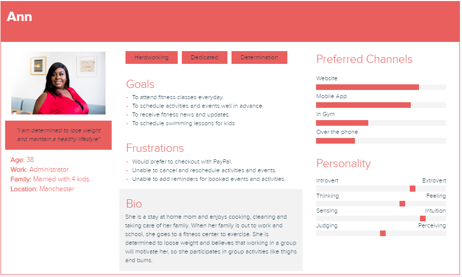
From the research, we developed a persona to reflect our user's key goals and frustrations.
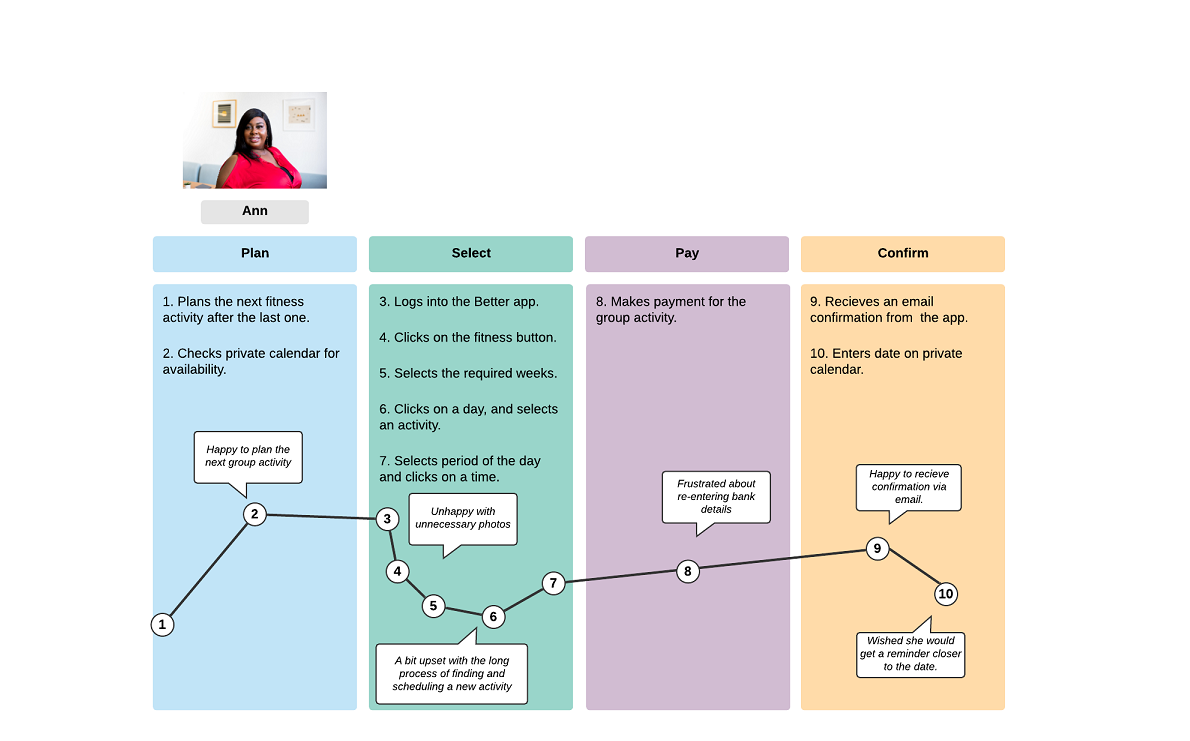
I then mapped out a Customer Journey to identify pain points and come up with possible oppurtunities for improvement.
With information gathered from the research, we embarked on brainstorming workshops to generate ideas and assumptions for a solution. We analyzed the results from the research and came up with key goals for the app.
Simplify the booking and payment process for fitness activities and gym pass.
implement app features/functions to improve customer experience
Create a consistent user interface across all screens.
User flow is the path taken by a prototypical user on a website or app to complete a task. The user flow takes them from their entry point through a set of steps towards a successful outcome and final action. I re-created a simplified process to solve the complex booking process painpoint identified during the research phase.
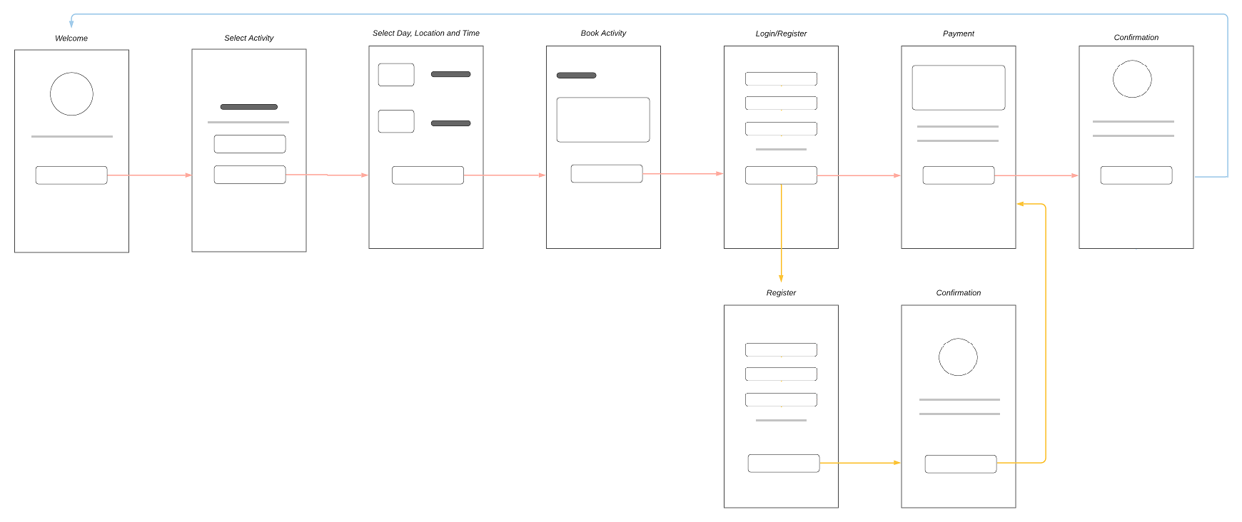
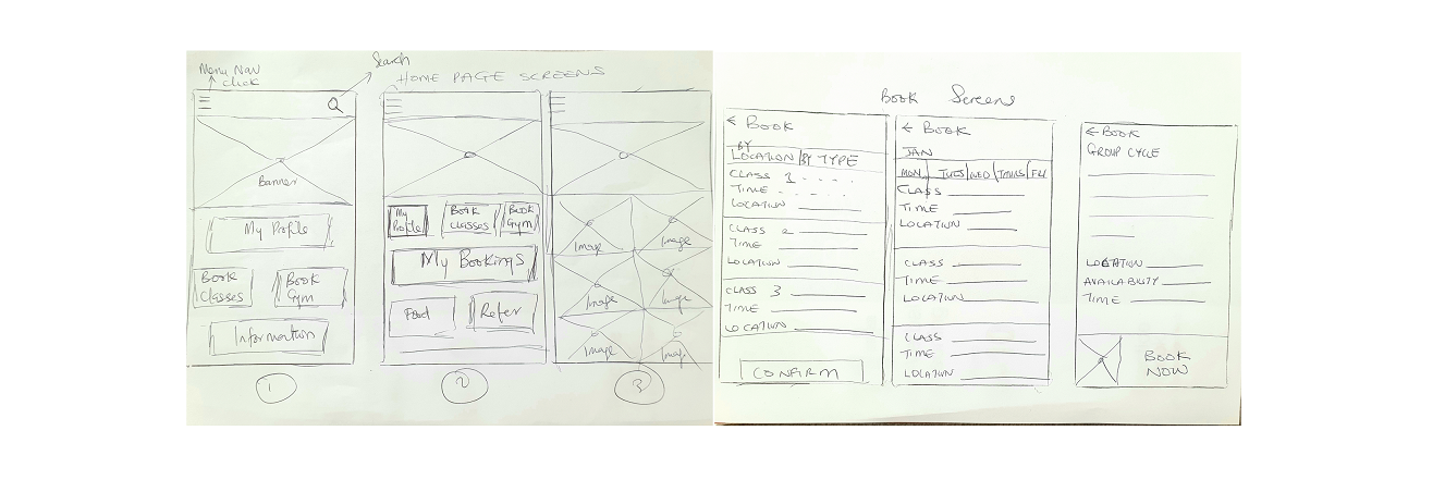
Using the user flow as a guide, we started by sketching on paper to identify the important elements and remove unnecessary items on screens. Our aim was to keep the interface simple and include only important elements.
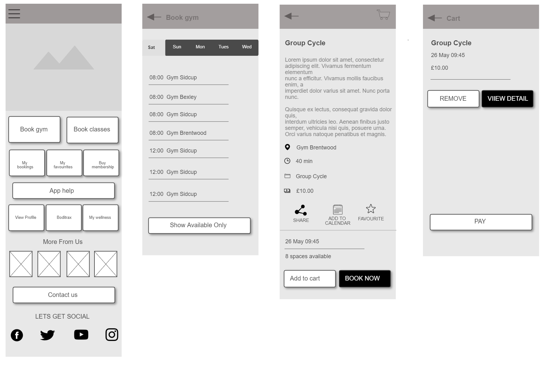
We created Wireframes to build the structure and architecture of the site information. We then developed scenarios for usability tests and went through multiple iterations;gathering useful insights to improve our solution.
Based on several test, feedbacks and user questions, we finally designed the end solution which addressed the key goals and painpoints identified during the research phase.
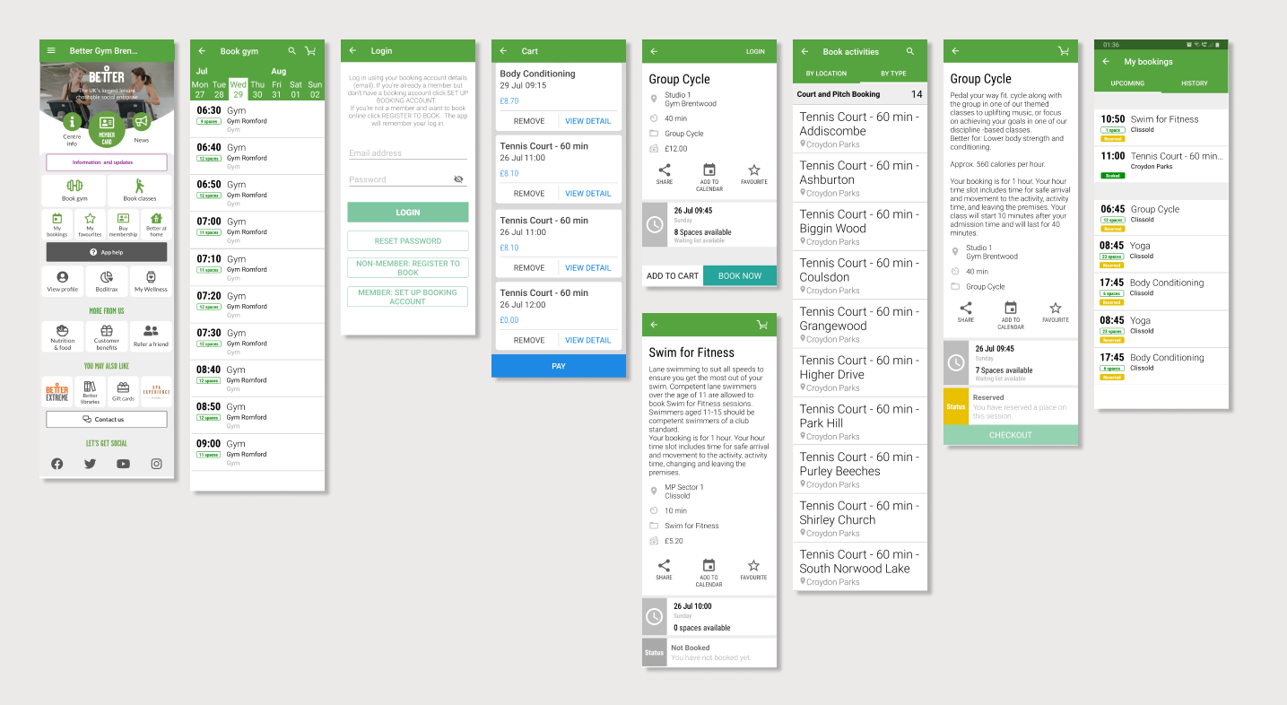
A simplified booking process in just 4 steps.
We removed irrelevant content and photos.
We added a "Cancel Booking" button on details page and checkout page to make it easy for users to cancel bookings.
We added "Add to Calendar" feature on details page to allow users set reminders.
We added clearly marked exit features on all screens.
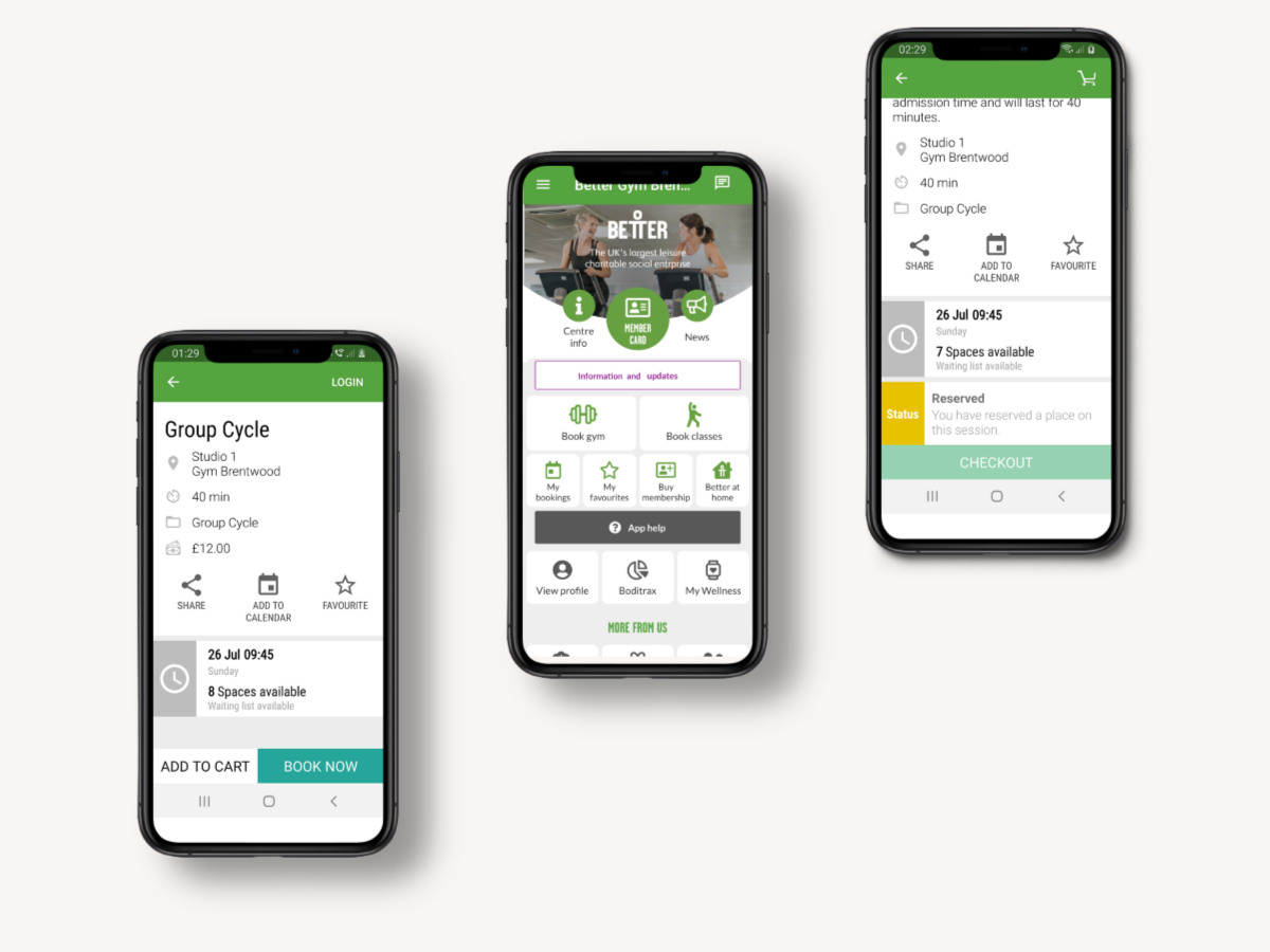
The company would need to conduct further research with users to identify more useful features.
The company would also need to consider further A/B tests and iterations to improve this version.
Launching the app is only the first step towards it's success. Analyzing quantitative data and metrics over time would be vital for understanding success in the long term.