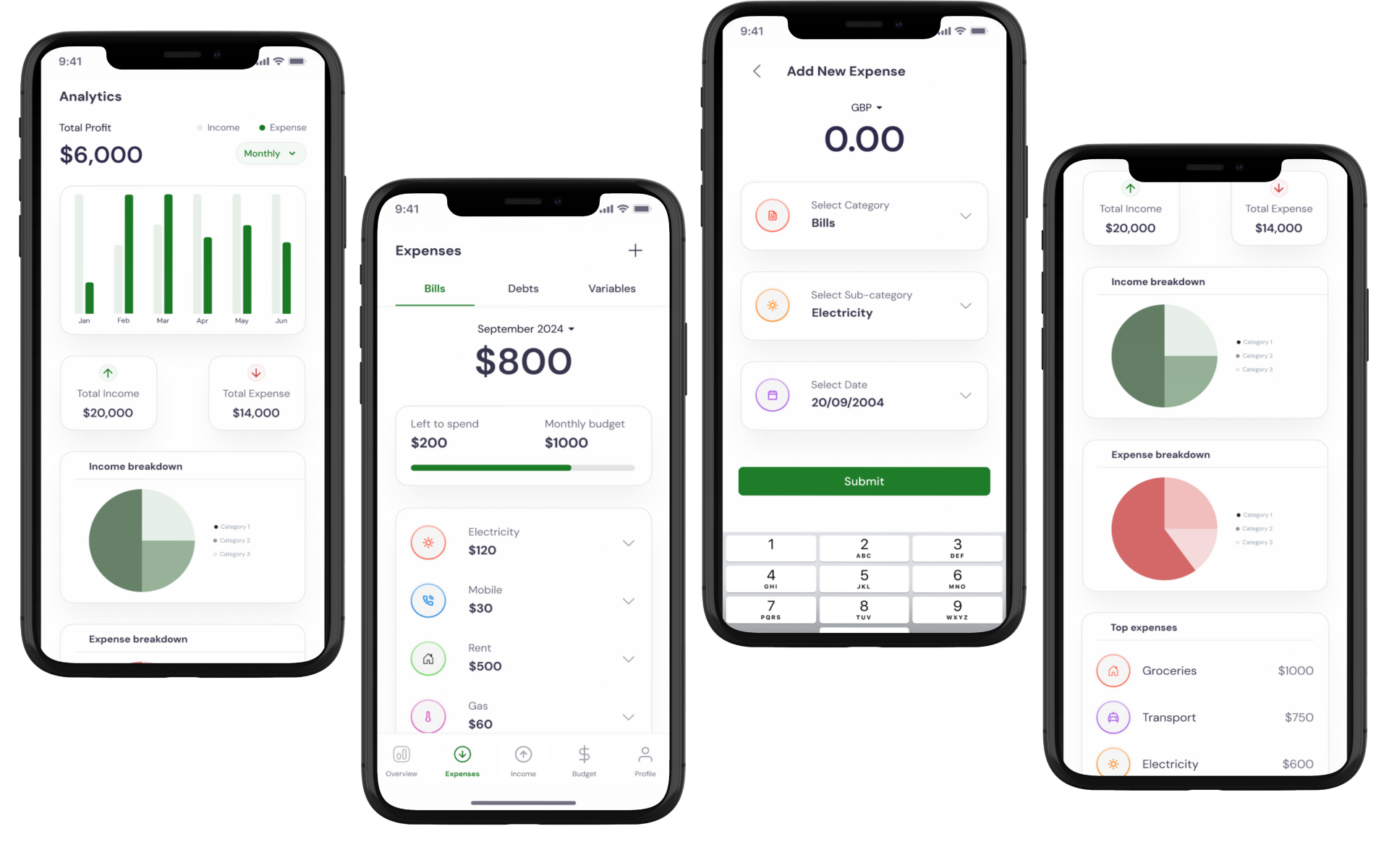
Purpose
This Income & Expense Tracking App was developed as a personal project to demonstrate my skills in designing intuitive, user-centered financial tools. The app is aimed at helping users gain control over their finances with easy-to-use budgeting and tracking features.
Objectives
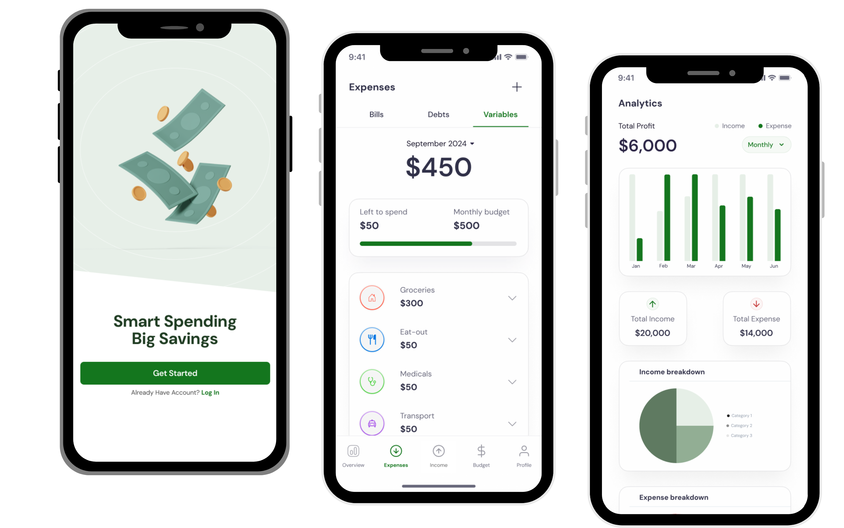
Research Objective
I aimed to design an intuitive income and expense tracking app that would simplify financial management and help users improve their budgeting habits. My research focused on understanding user expectations, analyzing competitor features, and identifying pain points to ensure a user-centered design approach.
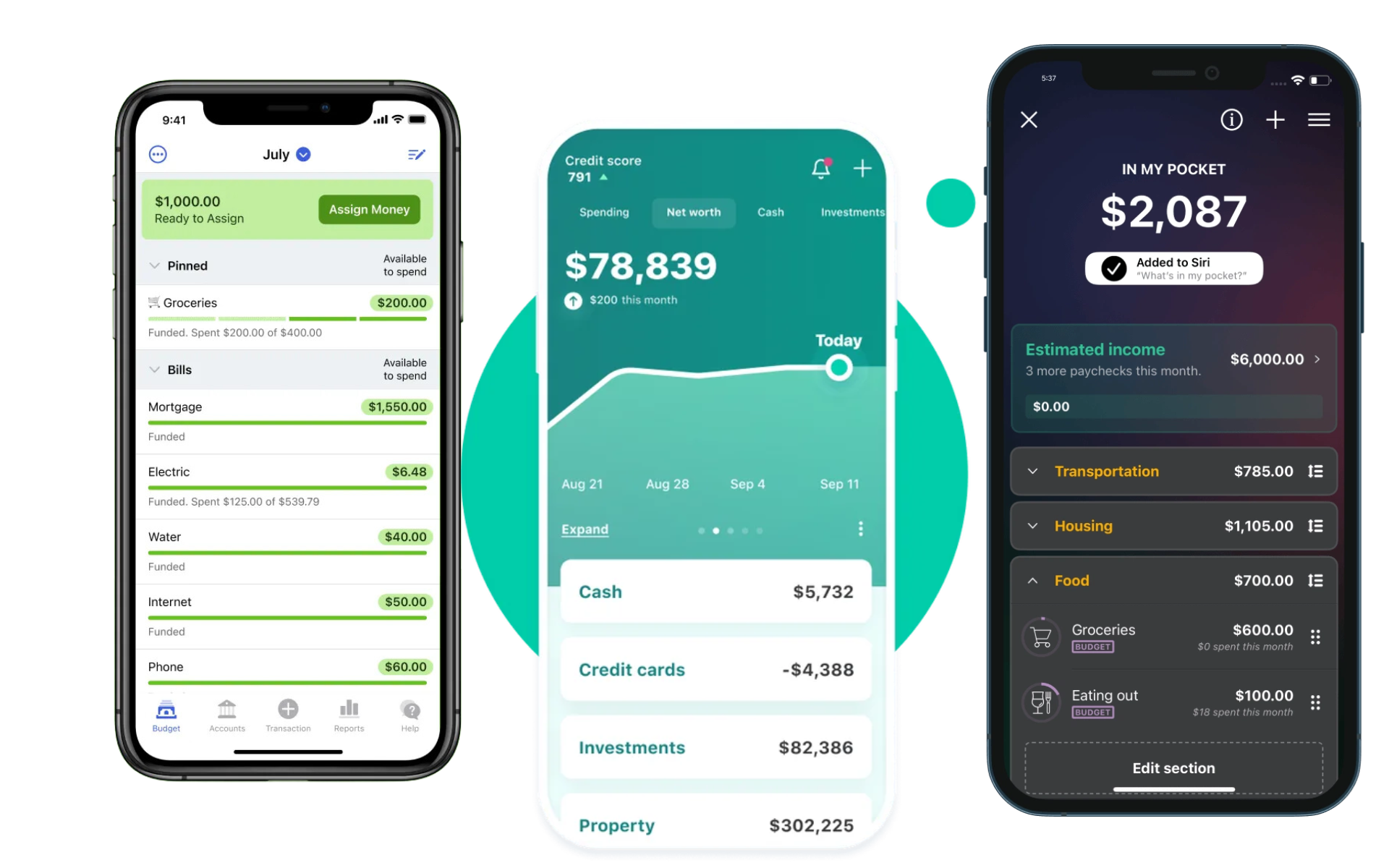
I reviewed popular budgeting and expense tracking apps, including Mint, PocketGuard, and YNAB, to analyze their key features, user experience, and design patterns.
Findings:
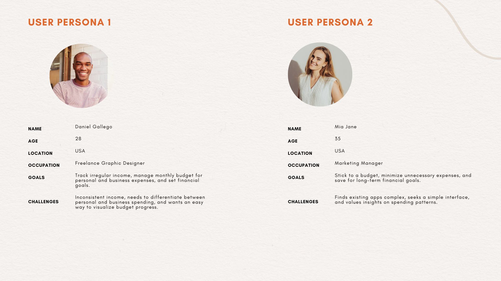
Based on my research, I created two primary user personas to guide my design.
Through a review of popular budgeting and expense tracking apps, I identified several common challenges that users often face.
Difficulty in Categorizing Expenses
Many users struggle to organize their expenses into meaningful categories, especially when tracking various types of spending such as bills, debts, and everyday purchases. This often leads to cluttered expense records and makes it challenging to get a clear financial overview.
Limited Visibility into Budget vs. Actual Spending
Users often find it difficult to monitor how their spending compares to their budget goals in real time. In some apps, this information is buried or not displayed in a clear, actionable way, leading to unexpected overspending.
Managing Multiple Income Sources
For users with diverse income streams (e.g., salary, freelance income, side gigs), tracking all sources in a single app can be challenging. Most apps don’t provide a clear, consolidated view of various income types, leading to incomplete income records.
Overly Complex Data Entry
In many apps, users are required to complete lengthy forms to add transactions, which discourages them from logging expenses consistently. This results in incomplete records and inaccurate budgeting.
Lack of Clear Visual Summaries
Users often need visual cues, like icons and graphs, to quickly understand their spending distribution. However, many apps lack effective visual summaries, which makes it harder for users to identify where most of their money is going.
Difficulty in Tracking Spending Over Time
Insight: Many users expressed a desire to compare their expenses month-over-month to identify trends and adjust their budgets accordingly. However, some apps don’t provide easy access to past data, limiting users’ ability to make data-driven financial decisions.
The ideation phase aimed to translate research insights into actionable design concepts, focusing on user needs and ensuring a seamless experience within the Income & Expense Tracking App. This process involved defining core user flows and creating user stories to guide the app’s features and functionality.
To visualize how users would interact with the app, I mapped out a user flow that guides them through key actions such as adding income or expenses, checking budget status, and viewing analytics.
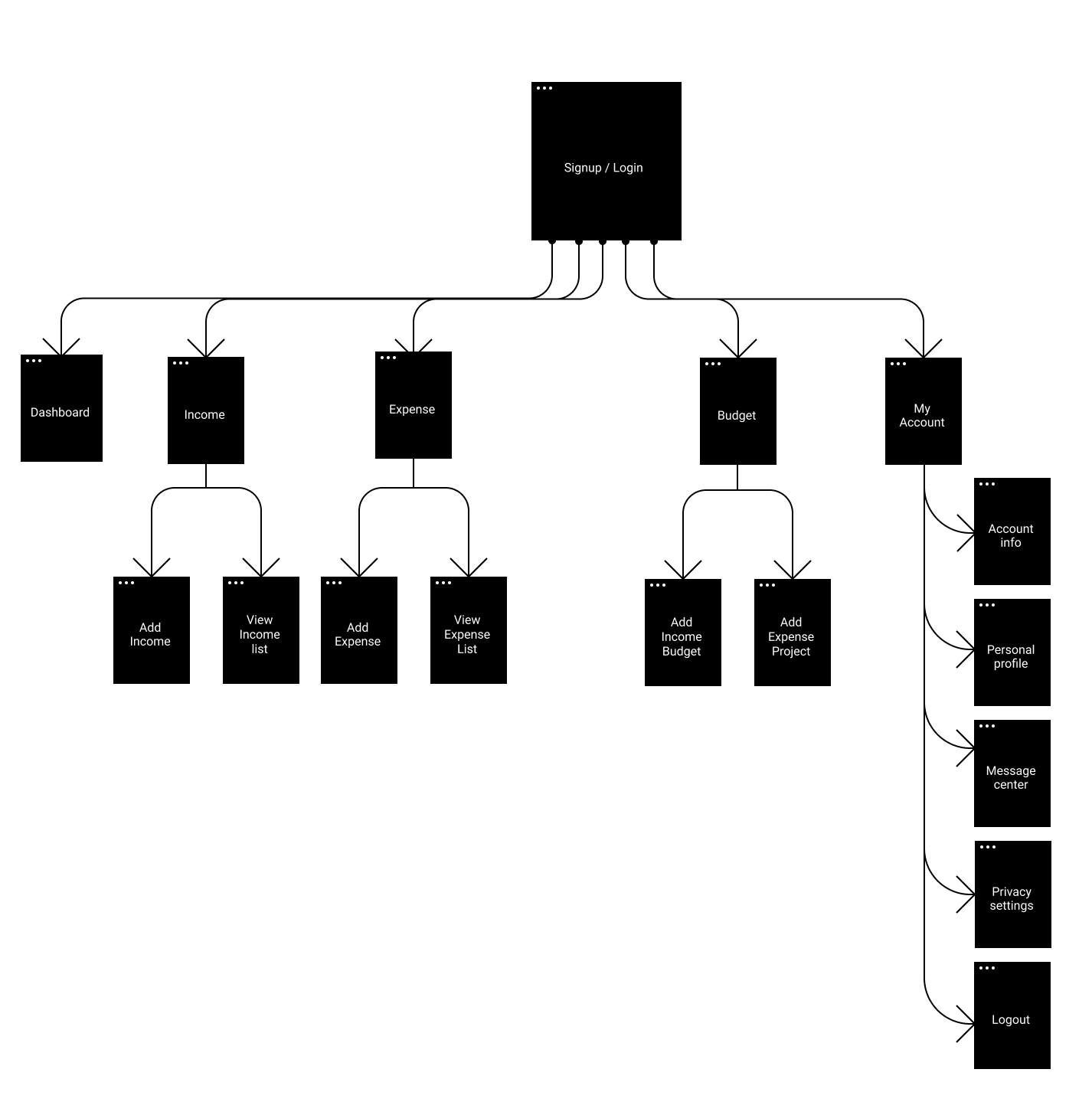
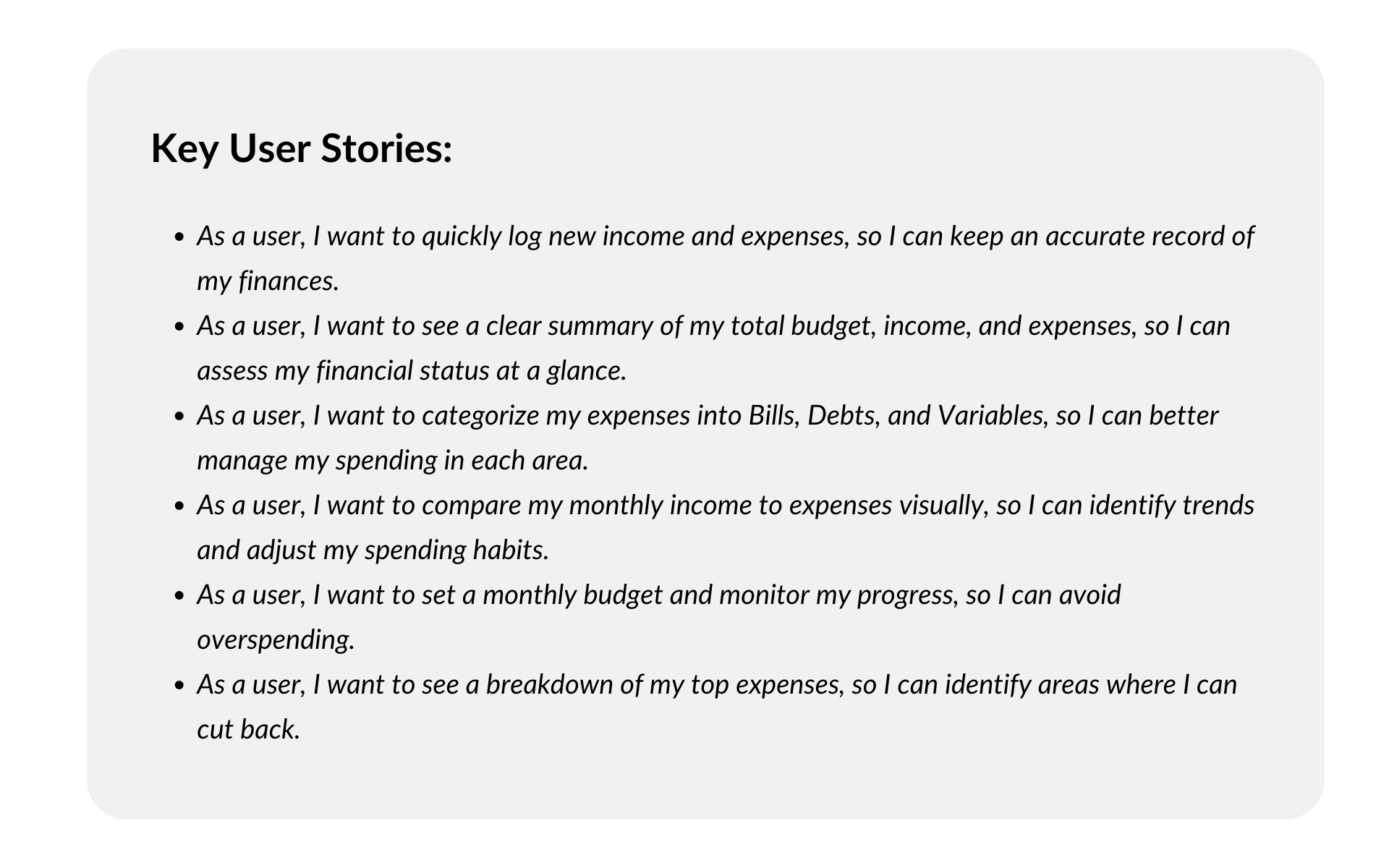
To ensure that the app meets user expectations, I developed user stories to represent the different tasks and goals users would accomplish with the app. These user stories helped inform specific app features and user experience design.
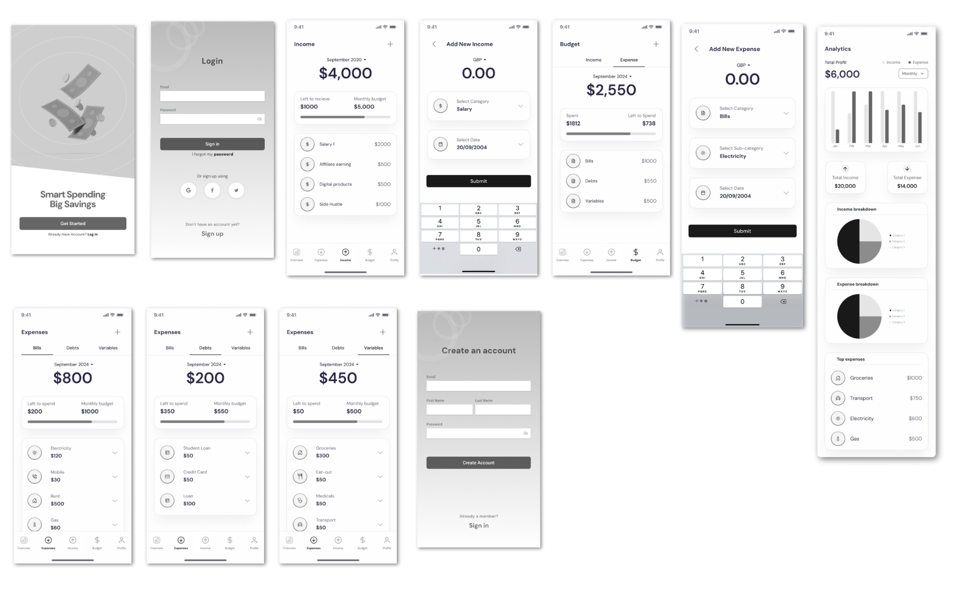
I began by creating low-fidelity wireframes in Figma to outline the basic structure and flow of the app. These wireframes provided a clear overview of key screens, including the Dashboard, Income, Expenses, and Analytics.
Focus: The low-fidelity wireframes focused on arranging essential elements, such as navigation tabs, summary sections, and transaction input fields, without the distraction of detailed design elements. This helped ensure a logical flow and efficient user journey from one screen to another.
After finalizing the structure in the low-fidelity phase, I transitioned to high-fidelity wireframes in Figma, adding color, typography, icons, and other UI elements to bring the design closer to the final product.
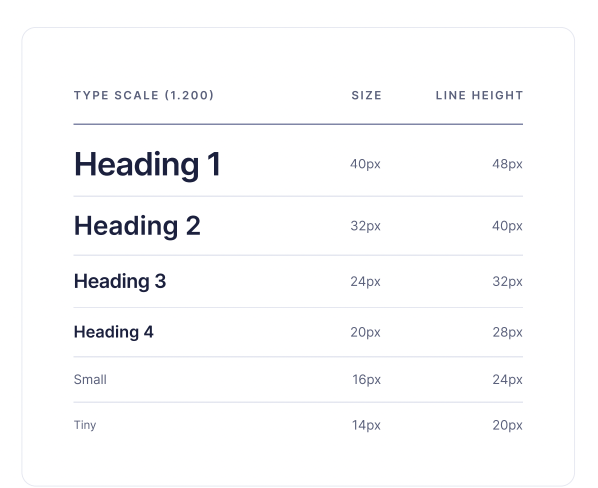
Design Elements: I used a clean, modern design with easy-to-read typography, a simple color palette, and intuitive icons for different expense categories (Bills, Debts, Variables). This helped make the app visually appealing and easy to navigate.
Outcome :The wireframing and prototyping stages ensured that the app’s design was both functional and visually engaging, with a user-centered layout that addressed identified pain points and provided clear pathways for primary user actions.
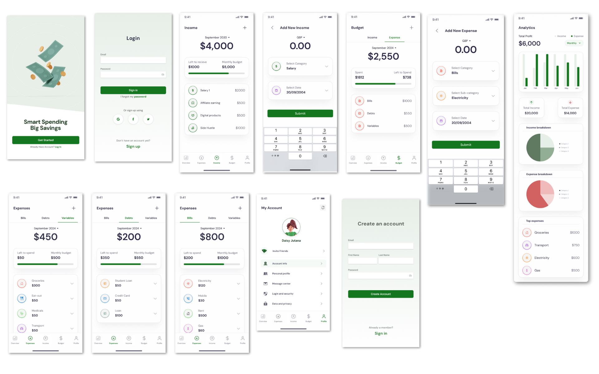
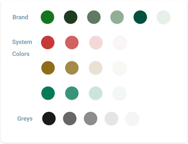
As part of the high-fidelity prototype, I carefully selected a color palette and typography that would enhance the app’s usability and visual appeal while aligning with its purpose as a budgeting and expense management tool.
Colors
Primary Color: A deep, calming green was chosen as the primary color to convey a sense of stability and financial growth. This color was used in progress bars, buttons, and icons to create consistency across the app.
Accent Colors: Soft, complementary shades were used to distinguish between categories (e.g., Bills, Debts, Variables) and highlight key areas like income versus expenses. This color-coding helps users quickly recognize sections and differentiate between types of financial data.
Background and Text: A light, neutral background was used to ensure a clean and uncluttered interface, while dark text colors were selected for readability and accessibility.
Typography
