When I first started designing, I was captivated by the trendy, complex, and glamorous designs I saw on various design sites. I would spend hours browsing these sites, amazed by the intricate layouts, bold color schemes, and countless elements packed into a single page. I thought to myself, “This is what good design looks like.” So, I practiced, trying to make my own designs just as complex and eye-catching.
But as I gained experience, I began to realize that a simple, clean approach could actually be more powerful. I discovered that “less is more” — a concept that’s easy to hear but harder to truly understand. Over time, I learned that by reducing unnecessary elements and focusing on what really matters, I could create designs that are not only beautiful but also functional, user-friendly, and impactful.
Here’s how we, as designers, can create with simplicity in mind.
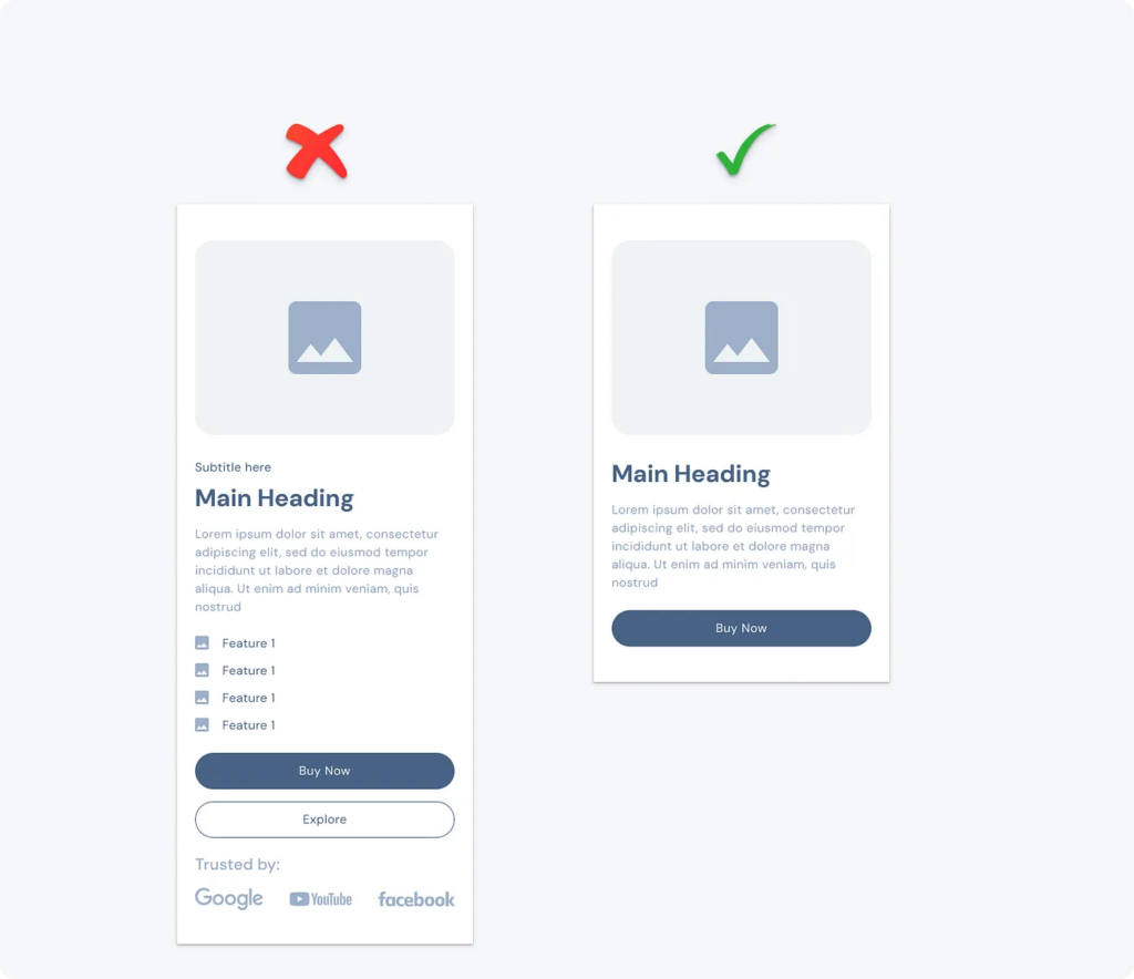
As designers, we often want to showcase everything our product can do. However, too much information can overwhelm users. Imagine a website packed with text, icons, and buttons everywhere. Instead of understanding the content, users end up feeling lost.
By focusing on what’s truly essential, we can eliminate distractions and help users find what they’re looking for quickly. Removing unnecessary information means only showing what’s relevant at the moment. This approach allows users to focus on the core message without the clutter.

When I started, I loved experimenting with various fonts, colors, and effects. But too many styles can create visual noise. Think about a website where every paragraph is in a different color or font — it’s confusing and tiresome to look at.
By sticking to a consistent style, you give your design a cohesive look that’s easy on the eyes. Users can navigate smoothly without being distracted by excessive decorations. The goal is to let the content shine, not the embellishments.
Minimalism and simplicity aren’t the same. A minimal design might look clean and modern, but if it hides essential details, it can become confusing. For example, removing labels from buttons to keep a design “minimal” might lead users to click the wrong thing.
Simplicity means making things easier for the user without sacrificing functionality. It’s about clarity, not just an aesthetic choice. Remember, a simple design should still communicate effectively, even if it doesn’t have every trendy style.
Today, users access content on various devices, and starting with a mobile-first approach ensures that the essential elements are prioritized. Designing for the smallest screen first forces you to think about what’s truly necessary.
If your design works well on a small screen, it will likely be effective on larger ones, too. This approach keeps you focused on the core elements and prevents overloading the layout with extras that won’t fit on mobile.
People can’t interact with what they can’t see. Hiding important content or actions behind menus or in hidden sections may keep the interface clean, but it risks users missing essential information. When you make important content easily visible, users are more likely to engage with it effectively.
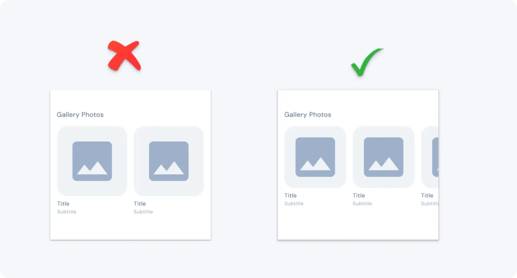
In the image below, the left design keeps only a few items visible while the right design makes additional content visible by adjusting spacing, allowing users to view more gallery photos at a glance without extra clicks.

Too many choices can lead to decision fatigue. Have you ever tried choosing from a long drop-down menu or a cluttered product list? It can be overwhelming, and users may even abandon the task.
Reducing choice speeds up decision-making and keeps users from feeling overwhelmed. Simplifying options, grouping items, or recommending the best choice are ways to guide users without making them think too hard.
Embracing the principle of less is more in design has transformed the way good design works. Rather than trying to impress with complexity, designers should focus on clarity, usability, and purpose. As designers, our goal should be to create experiences that are easy and enjoyable. Remember, a simple design doesn’t lack creativity — it embraces it in a way that truly serves the user.