Product / UX designer
4 Weeks
Figma , Miro
Context
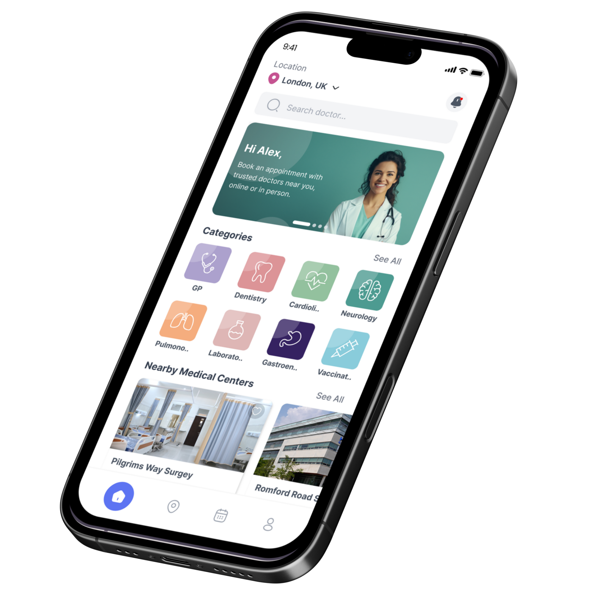
This is a course case study where I explored how NHS patients in the UK could experience a more seamless and accessible way of booking GP appointments. I wanted to apply my UX and product design process to a real-world challenge that affects millions of patients, guided by NHS Digital reports, survey insights, and accessibility standards.
Problem
Accessing GP services in the UK is often difficult due to long waiting times, limited appointment availability, and inefficient booking systems. According to NHS Digital, 40% of patients reported difficulties contacting their GP practice in 2022, and 25% abandoned attempts entirely due to the complexity of the process.
This results in:
Patients → frustration, delayed care, and poor satisfaction.
NHS Practices → high call volumes, wasted admin resources, and increased strain on staff.
Opportunity
This case study presented an opportunity to design a user-friendly digital booking solution that simplifies access, ensures inclusivity, and aligns with NHS Service Standards and WCAG 2.1 AA accessibility guidelines.
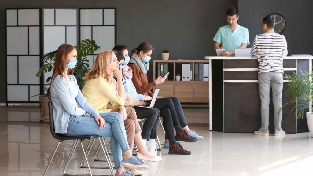
I chose the design thinking process to ensure a human-centered approach that prioritizes patient needs, incorporates stakeholder insights, and delivers a seamless, accessible, and efficient solution aligned with NHS standards
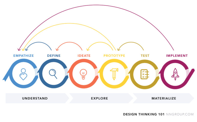
In this stage, I conducted health report analysis to understand systemic challenges, distributed user surveys via Google Forms to Facebook groups for direct patient feedback, and performed competitor analysis to identify best practices and gaps in existing GP appointment booking solutions.
1. Reviewed NHS Digital’s “GP Patient Survey 2023”, revealing:
2. Insights from King’s Fund Report on General Practice Pressures highlighted the inefficiency in traditional phone-based systems, leading to longer queues and administrative strain.

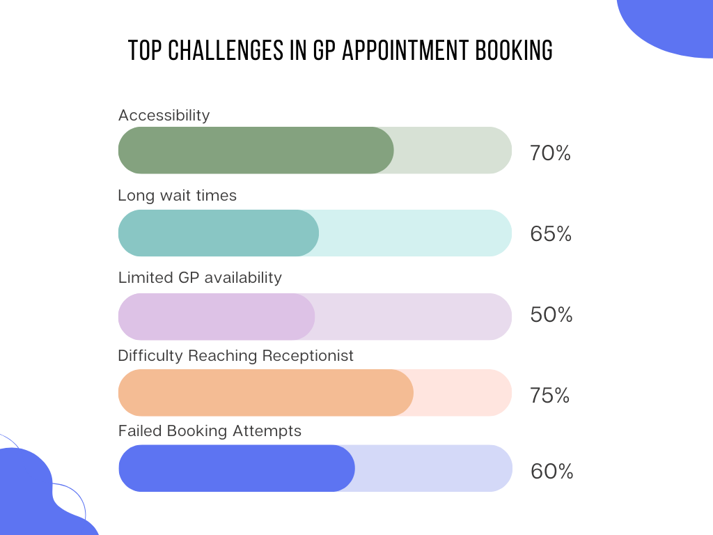
To gain user insights, I conducted a survey with 20 participants distributed via Google Forms in relevant Facebook groups. The survey aimed to understand patient experiences and pain points in booking GP appointments. Key findings included:
.
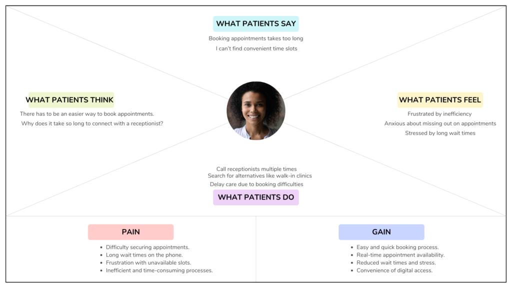
An empathy map was created to represent patient perspectives based on survey responses and health report analysis. The map categorized insights into four quadrants:
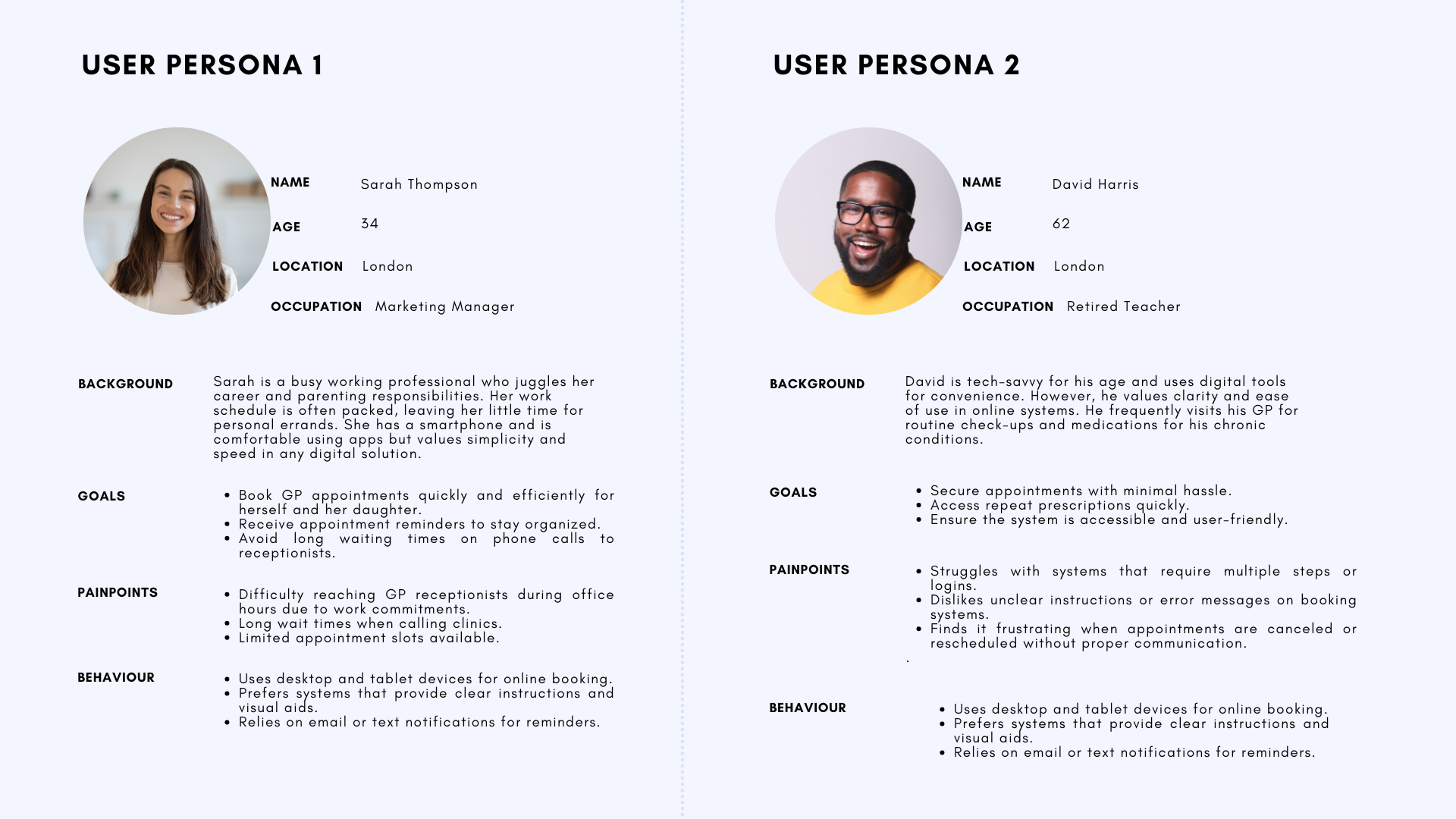
Personas were created to represent the primary user groups identified during the research phase. These personas embodied the key demographics, behaviors, and pain points observed in the user surveys and empathy mapping
To understand the user experience of booking a GP appointment, I created a user journey map that outlines the key stages, touchpoints, and user emotions throughout the process. This helped identify pain points and opportunities for improvement.
To understand the user experience of booking a GP appointment, I created a user journey map that outlines the key stages, touchpoints, and user emotions throughout the process. This helped identify pain points and opportunities for improvement.
Key Stages:
�
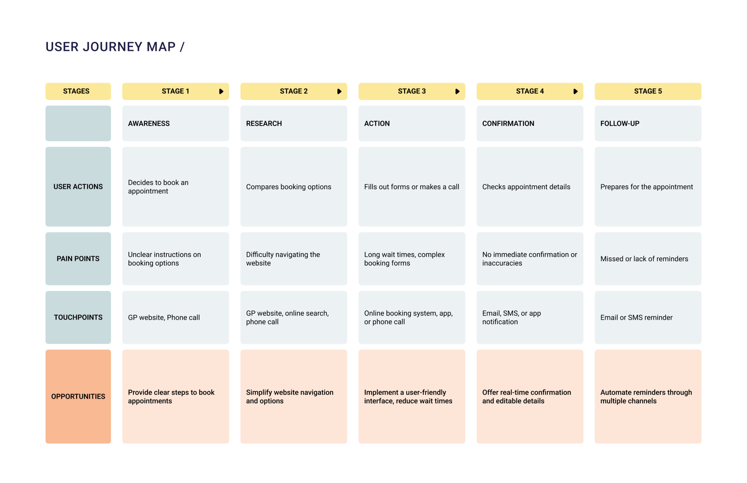
From my analysis, i derived insights on the user’s pain points and opportunities which include;
Pain Points:
Opportunities:
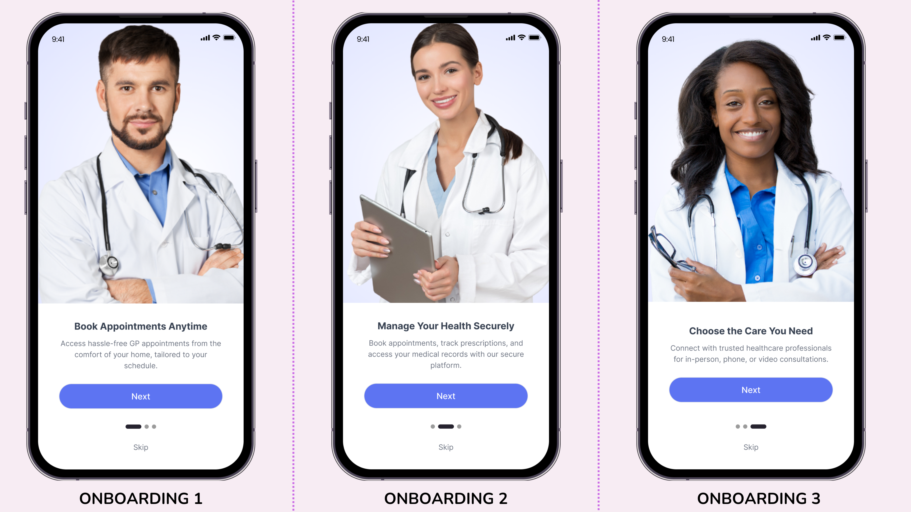
The user flow was created to map out the step-by-step journey users take to accomplish key tasks in the Patient Health app, such as onboarding, signing up, booking appointments, and managing their profiles. This user flow helps ensure that the design supports a seamless and intuitive user experience while addressing user pain points identified during the research phase.
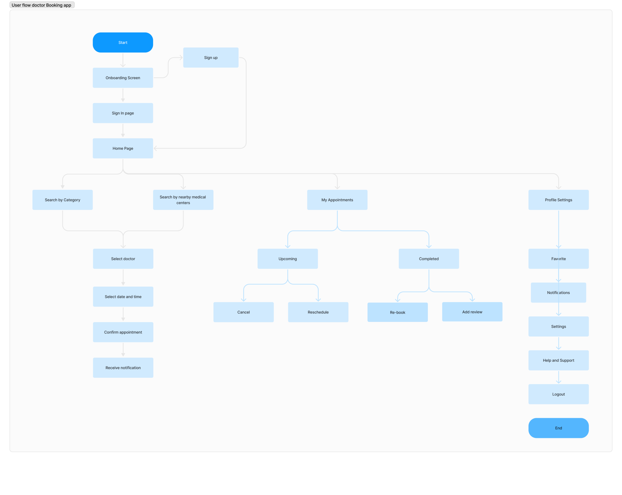
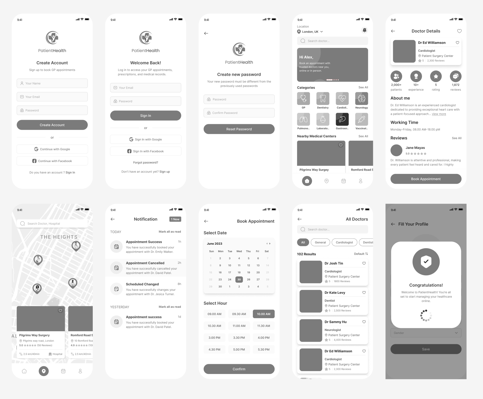
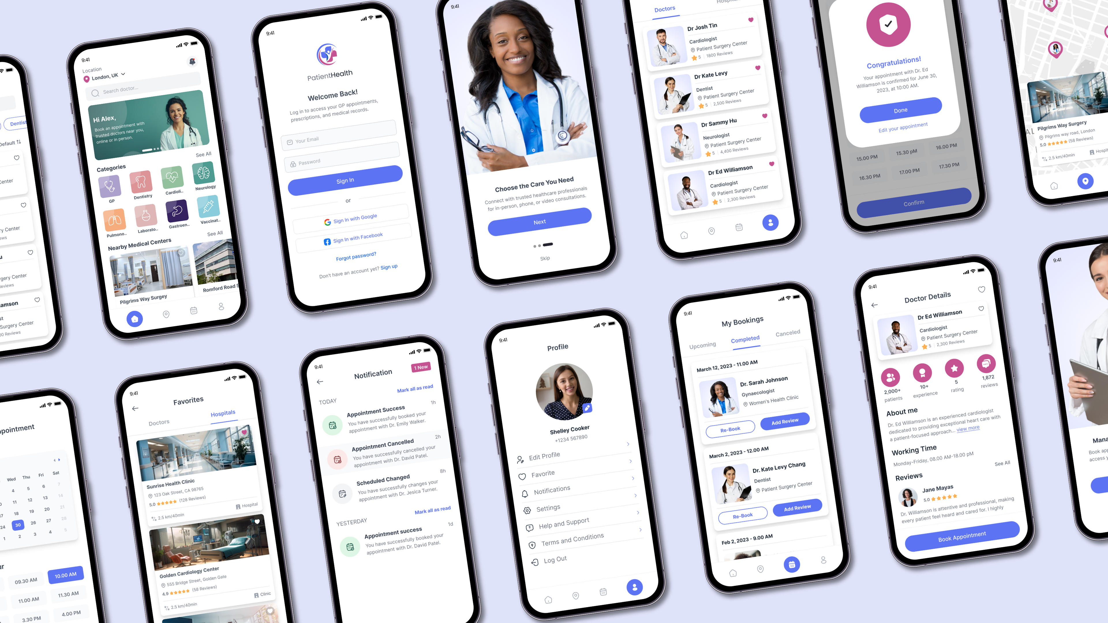
The Prototype phase is where ideas began to take shape, transitioning from concepts to tangible designs. At this stage, I created low-fidelity wireframes and a high-fidelity prototype to visualize and refine the app’s structure, functionality, and user interactions.
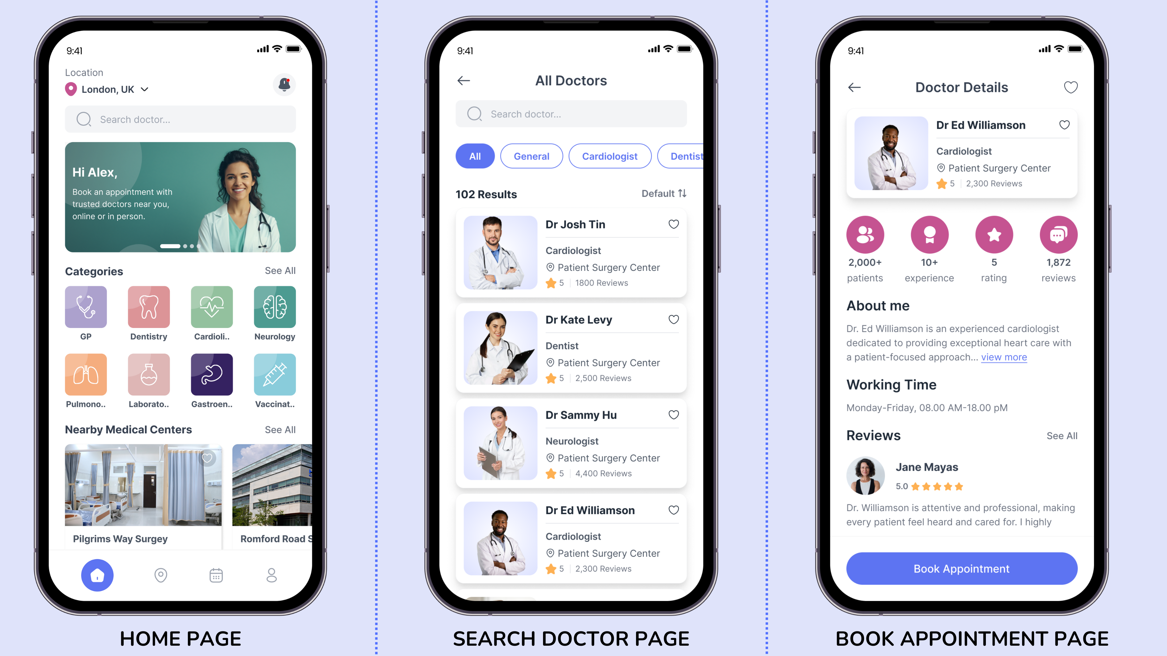
To outline the basic structure and layout of the app, I developed low-fidelity wireframes using Figma. These wireframes focused on key screens, such as onboarding, sign-up, doctor search, and appointment booking, ensuring the user flow aligned with the insights gathered in the previous phases.
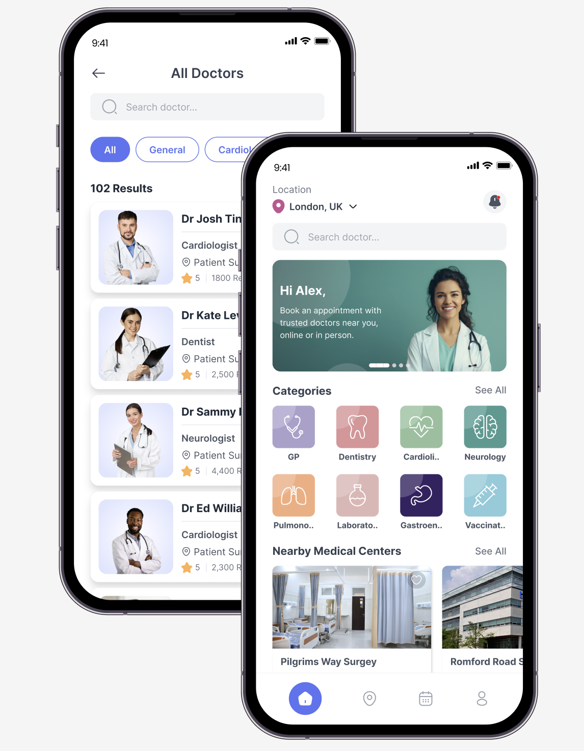
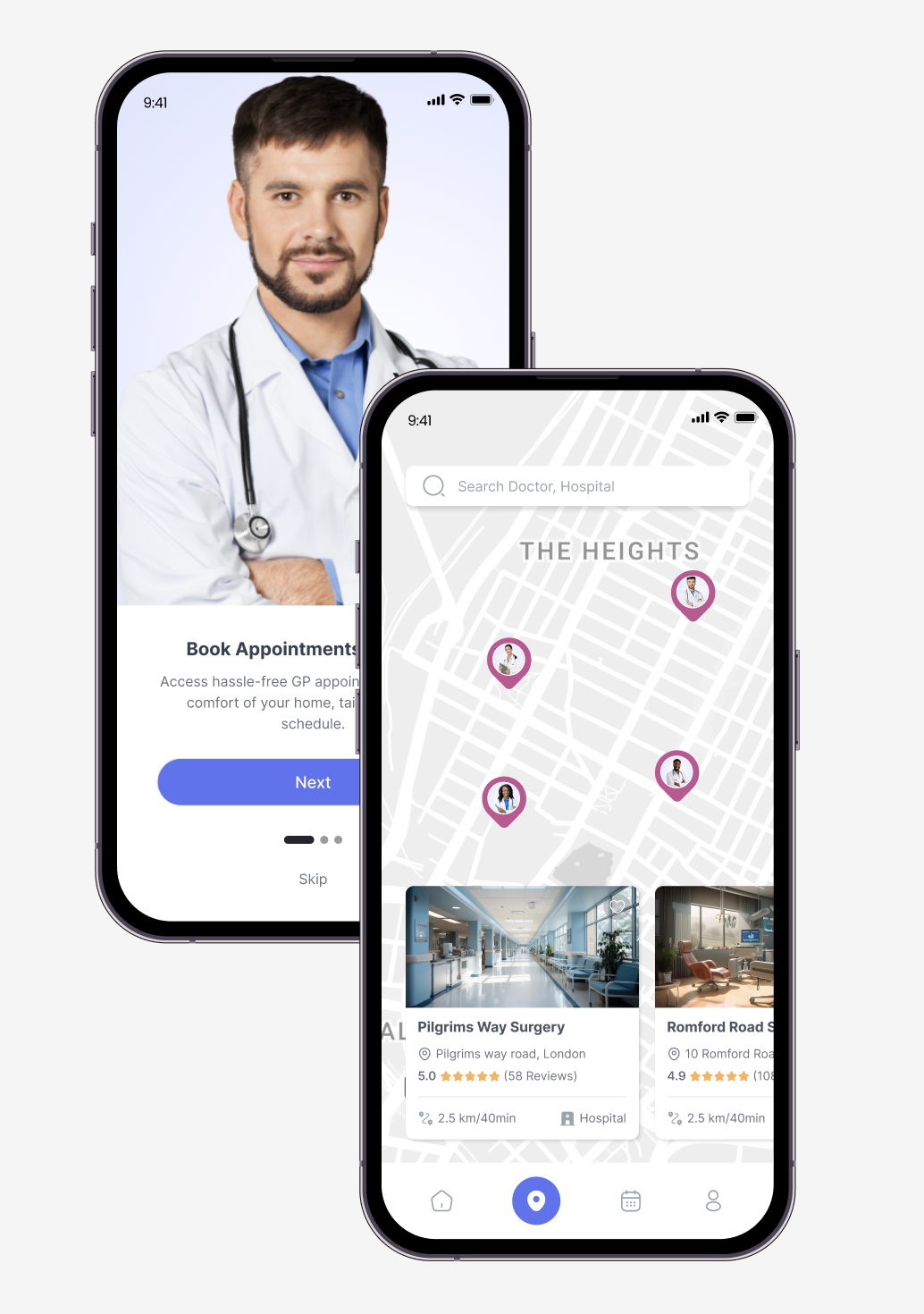
Building on the low-fidelity wireframes, I designed a high-fidelity prototype in Figma, incorporating branding, color schemes, and interactivity. This prototype provided a realistic simulation of the app, enabling stakeholders to experience the design and gather user feedback effectively.
Objective:
To evaluate the initial prototype’s usability and identify potential areas of improvement.
Methodology:
Key Findings:
Objective:
To test the updated prototype after implementing solutions from Usability Test 1.
Methodology:
Key Findings:
