Company/CLient

Greenwich Leisure Limited - Fitness App

Scope

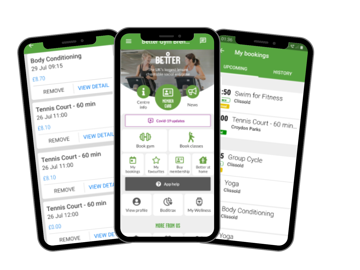
The fitness app allows members to book classes and sports activities, find local facility and pool opening times. Additionally, they are able buy tickets for activities, get facility news and lots more.

Role

I worked in a team of 2 UX designers as a UX/UI Designer and we were responsible for maximising user experience through improved app features and styles.

PROJECT BRIEF

I spoke with the project manager and business stakeholders to get a better understanding of the business goals and needs. The goals highlighted include:

  1. Create new features that will improve user experience.
  2. Improve app architecture and navigation.
  3. Increase conversion through a clear and simple checkout process.
  4. Ensure accessibility improvements to comply with WCAG standards and enhance usability for all users.
Â

We identified some project limitations and they include:

  1. Limited developer resources.
  2. Design scope was limited to fit around the developers code library.
  3. Limited time resources due to urgent deadlines.

DESIGN PROCESS

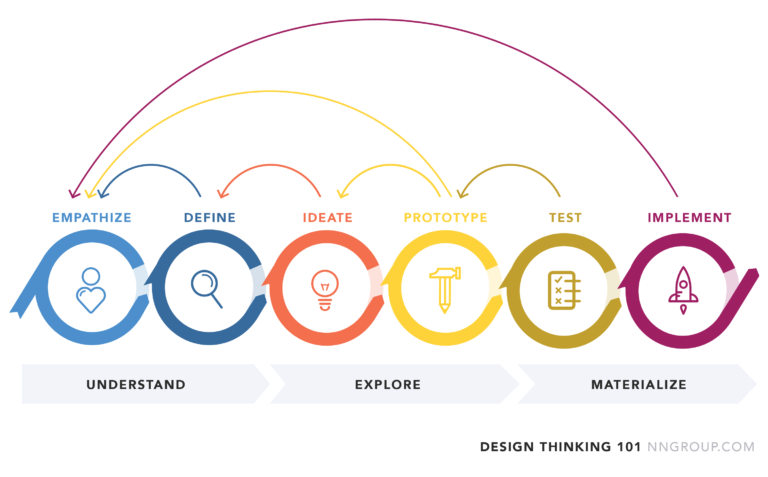
We adopted the design thinking iterative process as this method allows us to understand our users and create innovative solutions through iterative prototyping and testing.
EMPATHISE

We needed to gather adequate information about our users, their needs and painpoints, so we adopted different research methods to achieve this goal.

DISCOVERY

I decided to conduct a heuristic evaluation of the app while booking a fitness activity for myself. After the evaluation, I discovered the following issues:

  1. Inconsistency in the use of background colours in the home page and subpages, making it difficult for users with visual impairments to distinguish sections.
  2. The exits were not clearly marked, and I got confused about going back to the previous page, impacting navigation for all users, especially those relying on screen readers.
  3. Users should be able to set notifications of events and activities, ensuring the app accommodates diverse user needs, including those with cognitive impairments.
USER INTERVIEWS AND USABILITY TESTS

To validate my findings, we conducted usability tests and asked users to perform some tasks on the app. I encouraged them to think aloud while performing the tasks and asked questions after they completed the tasks. Accessibility was a core focus during these tests, and we ensured diverse users, including those with disabilities, were part of the testing process. The result from 10 user interviews and usability tests provided the following insights:

  1. The online booking process was long and complex, presenting challenges for users with cognitive impairments.
  2. Unnecessary and distracting content
  3. The button to cancel a booking was difficult to locate, affecting both usability and accessibility for all users, including visually impaired users.
  4. The notifications button was difficult to find, limiting access for all users.

DEFINE

PERSONA

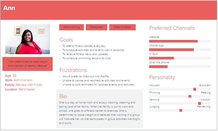
From the research, we developed a persona to reflect our user’s key goals and frustrations.
CUSTOMER JOURNEY

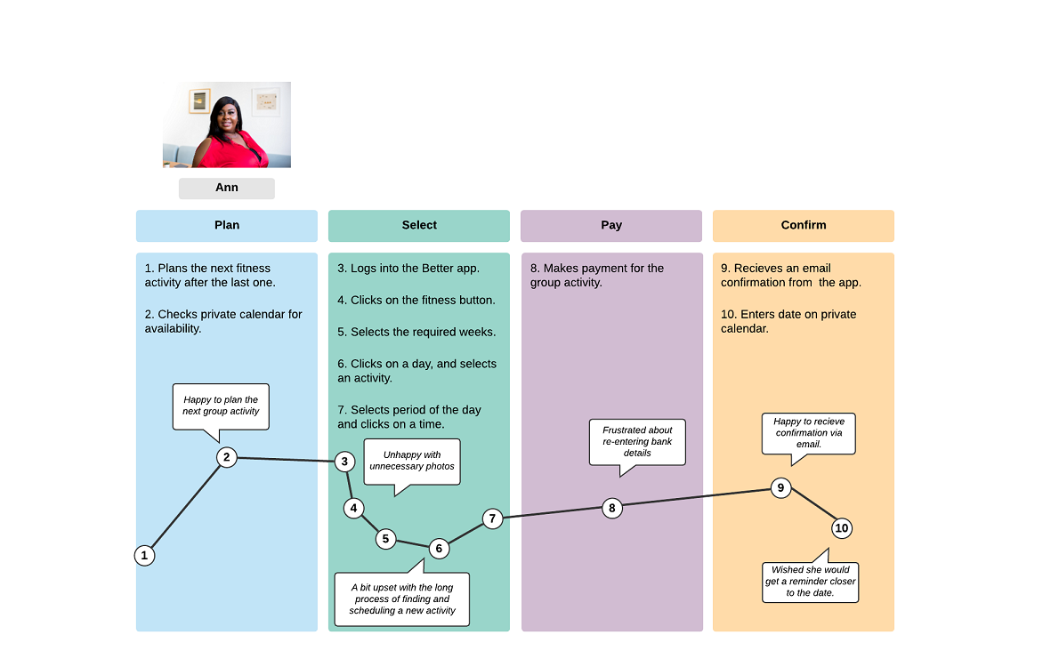
I then mapped out a Customer Journey to identify pain points and come up with possible oppurtunities for improvement.
IDEATE

BRAINSTORMING

With information gathered from the research, we embarked on brainstorming workshops to generate ideas and assumptions for a solution. We analyzed the results from the research and came up with key goals for the app.

  1. Simplify the booking and payment process for fitness activities and gym passes to ensure usability for all, including users with disabilities.
  2. Implement app features/functions to improve the customer experience, with a focus on accessibility.
  3. Create a consistent and accessible user interface across all screens, adhering to WCAG standards for color contrast, text sizing, and navigational clarity.
USERFLOW

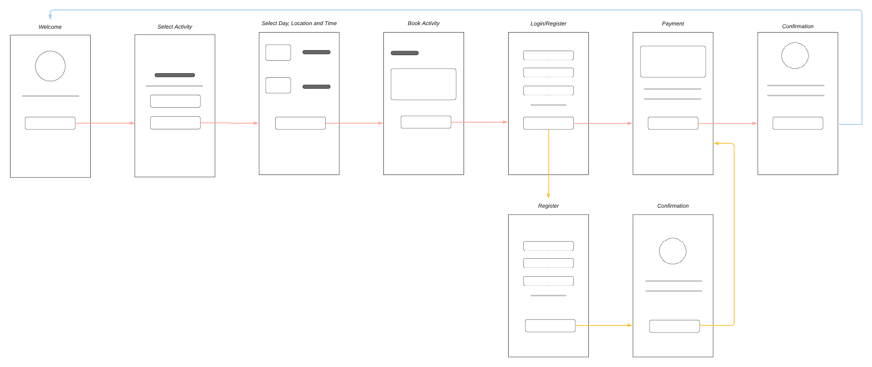
User flow is the path taken by a prototypical user on a website or app to complete a task. The user flow takes them from their entry point through a set of steps towards a successful outcome and final action. I re-created a simplified process to solve the complex booking process painpoint identified during the research phase.
PROTOTYPE & TESTING

PAPER PROTOTYPES

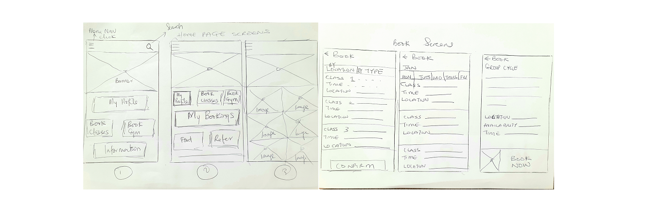
Using the user flow as a guide, we started by sketching on paper to identify the important elements and remove unnecessary items on screens. Our aim was to keep the interface simple and include only important elements.
WIREFRAMES

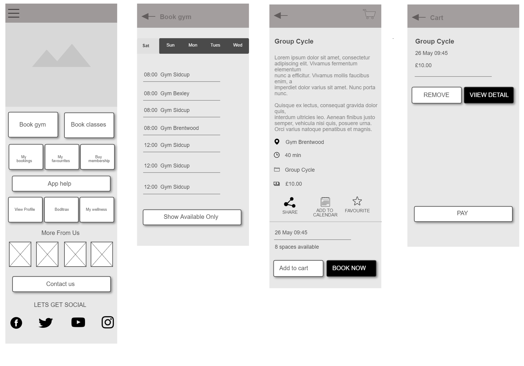
We created Wireframes to build the structure and architecture of the site information. We then developed scenarios for usability tests and went through multiple iterations;gathering useful insights to improve our solution.
HIGH FIDELITY PROTOTYPES

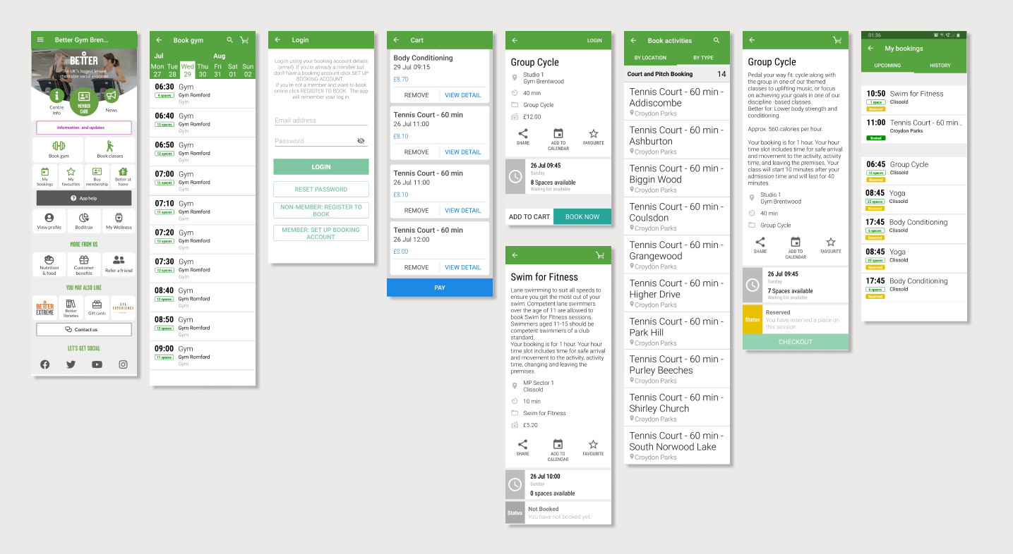
Based on several test, feedbacks and user questions, we finally designed the end solution which addressed the key goals and painpoints identified during the research phase.
EVALUATE

SOLUTION FEATURES
    1. Simplified the booking process in 4 steps, ensuring usability and accessibility for all users.
    2. Removed irrelevant content to create a cleaner interface, reducing distractions for a seamless experience.
    3. Added a “Cancel Booking” button with clear labeling for easy access.
    4. Integrated an “Add to Calendar” feature, making reminders simple for all users.
    5. Added clearly marked exit features to improve navigation and meet usability standards.
HANDOFF AND RECOMMEDNATIONS
  1. Conduct further research to refine features for all users, focusing on inclusivity.
  2. Perform A/B testing to enhance usability and accessibility for diverse needs.
  3. Monitor metrics like navigation success rates to ensure long-term improvement.